The information technology industry is in the middle of a powerful trend towards machine learning and artificial intelligence. These are difficult skills to master but if you embrace them and just do it, you’ll be making a very significant step towards advancing your career. As with any learning curve, it’s useful to start simple. The K-Means clustering algorithm is pretty intuitive and easy to understand, so in this post I’m going to describe what K-Means does and show you how to experiment with it using Spark and Python, and visualize its results in a Jupyter notebook.
What is K-Means?
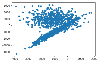
k-means clustering aims to group a set of objects in such a way that objects in the same group (or cluster) are more similar to each other than to those in other groups (clusters). It operates on a table of values where every cell is a number. K-Means only supports numeric columns. In Spark those tables are usually expressed as a dataframe. A dataframe with two columns can be easily visualized on a graph where the x-axis is the first column and the y-axis is the second column. For example, here’s a 2 dimensional graph for a dataframe with two columns.
If you were to manually group the data in the above graph, how would you do it? You might draw two circles, like this:
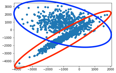
And in this case that is pretty close to what you get through k-means. The following figure shows how the data is segmented by running k-means on our two dimensional dataset.
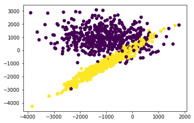
Charting feature columns like that can help you make intuitive sense of how k-means is segmenting your data.
Visualizing K-Means Clusters in 3D
The above plots were created by clustering two feature columns. There could have been other columns in our data set, but we just used two columns. If we want to use an additional column as a clustering feature we would want to visualize the cluster over three dimensions. Here’s an example that shows how to visualize cluster shapes with a 3D scatter/mesh plot in a Jupyter notebook using Python 3:
# Initialize plotting library and functions for 3D scatter plots
from sklearn.datasets import make_blobs
from sklearn.datasets import make_gaussian_quantiles
from sklearn.datasets import make_classification, make_regression
from sklearn.externals import six
import pandas as pd
import numpy as np
import argparse
import json
import re
import os
import sys
import plotly
import plotly.graph_objs as go
plotly.offline.init_notebook_mode()

def rename_columns(df, prefix='x'):
    """
    Rename the columns of a dataframe to have X in front of them

    :param df: data frame we're operating on
    :param prefix: the prefix string
    """
    df = df.copy()
    df.columns = [prefix + str(i) for i in df.columns]
    return df
# Create an artificial dataset with 3 clusters for 3 feature columns
X, Y = make_classification(n_samples=100, n_classes=3, n_features=3, n_redundant=0, n_informative=3,
                             scale=1000, n_clusters_per_class=1)
df = pd.DataFrame(X)
# rename X columns
df = rename_columns(df)
# and add the Y
df['y'] = Y
df.head(3)
# Visualize cluster shapes in 3d.

cluster1=df.loc[df['y'] == 0]
cluster2=df.loc[df['y'] == 1]
cluster3=df.loc[df['y'] == 2]

scatter1 = dict(
    mode = "markers",
    name = "Cluster 1",
    type = "scatter3d",
    x = cluster1.as_matrix()[:,0], y = cluster1.as_matrix()[:,1], z = cluster1.as_matrix()[:,2],
    marker = dict( size=2, color='green')
)
scatter2 = dict(
    mode = "markers",
    name = "Cluster 2",
    type = "scatter3d",
    x = cluster2.as_matrix()[:,0], y = cluster2.as_matrix()[:,1], z = cluster2.as_matrix()[:,2],
    marker = dict( size=2, color='blue')
)
scatter3 = dict(
    mode = "markers",
    name = "Cluster 3",
    type = "scatter3d",
    x = cluster3.as_matrix()[:,0], y = cluster3.as_matrix()[:,1], z = cluster3.as_matrix()[:,2],
    marker = dict( size=2, color='red')
)
cluster1 = dict(
    alphahull = 5,
    name = "Cluster 1",
    opacity = .1,
    type = "mesh3d",
    x = cluster1.as_matrix()[:,0], y = cluster1.as_matrix()[:,1], z = cluster1.as_matrix()[:,2],
    color='green', showscale = True
)
cluster2 = dict(
    alphahull = 5,
    name = "Cluster 2",
    opacity = .1,
    type = "mesh3d",
    x = cluster2.as_matrix()[:,0], y = cluster2.as_matrix()[:,1], z = cluster2.as_matrix()[:,2],
    color='blue', showscale = True
)
cluster3 = dict(
    alphahull = 5,
    name = "Cluster 3",
    opacity = .1,
    type = "mesh3d",
    x = cluster3.as_matrix()[:,0], y = cluster3.as_matrix()[:,1], z = cluster3.as_matrix()[:,2],
    color='red', showscale = True
)
layout = dict(
    title = 'Interactive Cluster Shapes in 3D',
    scene = dict(
        xaxis = dict( zeroline=True ),
        yaxis = dict( zeroline=True ),
        zaxis = dict( zeroline=True ),
    )
)
fig = dict( data=[scatter1, scatter2, scatter3, cluster1, cluster2, cluster3], layout=layout )
# Use py.iplot() for IPython notebook
plotly.offline.iplot(fig, filename='mesh3d_sample')
You can interact with that 3D graph with click-drag or mouse wheel to zoom.
Visualizing K-Means Clusters in N Dimensions
What if you’re clustering over more than 3 columns? How do you visualize that? One common approach is to split the 4th dimension data into groups and plot a 3D graph for each of those groups. Another approach is to split all the data into groups based on the k-means cluster value, then apply an aggregation function such as sum or average to all the dimensions in that group, then plot those aggregate values in a heatmap. This approach is described in the next section.
Visualizing Higher Order clusters for a Customer 360 scenario
In the following notebook, I’ve produced an artificial dataset with 12 feature columns. I’m using this dataset to simulate a customer 360 dataset in which customers for a large bank have been characterized by a variety of attributes, such as the balances in various accounts. By plotting the k-means cluster groups and feature columns in a heatmap we can illustrate how a large bank could use machine learning to categorize their customer base into groups so that they could conceivably develop things like marketing campaigns or recommendation engines that more accurately target the concerns of the customers in those groups.
#Initializes plotting library and functions for 3D scatter plots
from pyspark.ml.feature import VectorAssembler
from sklearn.datasets import make_blobs
from sklearn.datasets import make_gaussian_quantiles
from sklearn.datasets import make_classification, make_regression
from sklearn.externals import six
import pandas as pd
import numpy as np
import argparse
import json
import re
import os
import sys
import plotly
import plotly.graph_objs as go
plotly.offline.init_notebook_mode()

def rename_columns(df, prefix='x'):
    """
    Rename the columns of a dataframe to have X in front of them

    :param df: data frame we're operating on
    :param prefix: the prefix string
    """
    df = df.copy()
    df.columns = [prefix + str(i) for i in df.columns]
    return df
# create an artificial dataset with 3 clusters
X, Y = make_classification(n_samples=100, n_classes=4, n_features=12, n_redundant=0, n_informative=12,
                             scale=1000, n_clusters_per_class=1)
df = pd.DataFrame(X)
# ensure all values are positive (this is needed for our customer 360 use-case)
df = df.abs()
# rename X columns
df = rename_columns(df)
# and add the Y
df['y'] = Y

# split df into cluster groups
grouped = df.groupby(['y'], sort=True)

# compute sums for every column in every group
sums = grouped.sum()
sums
data = [go.Heatmap( z=sums.values.tolist(),
                   y=['Persona A', 'Persona B', 'Persona C', 'Persona D'],
                   x=['Debit Card',
                      'Personal Credit Card',
                      'Business Credit Card',
                      'Home Mortgage Loan',
                      'Auto Loan',
                      'Brokerage Account',
                      'Roth IRA',
                      '401k',
                      'Home Insurance',
                      'Automobile Insurance',
                      'Medical Insurance',
                      'Life Insurance',
                      'Cell Phone',
                      'Landline'
                     ],
                   colorscale='Viridis')]

plotly.offline.iplot(data, filename='pandas-heatmap')
